
I’ve always been fascinated by old maps. As I look at these sepia illustrations of barely-explored continents, cartoonish mountain ranges, and antiquarian fonts, I try to imagine how people back then viewed them. Did they see these impressionistic sketches as literal representations of the planet? They seem to differ so much from our maps today which contain such precise information. The truth is, there is no such thing as a perfect map. Maps have political and cultural biases, and have always been steeped in distortions. For example, while some cylindrical projections preserve the relative size of the continents while distorting their shape, the mercator projection depicts the accurate shape but dramatically distorts the size. This one infamously depicts Greenland as the same size as Africa, even though it is fourteen times smaller. This, and the fact that Europe and North America are almost exclusively at the top of the map, have consequences that extend beyond the map itself. These map projections are Eurocentric and exaggerate the centrality and size of the continent. One of my favorite projections, Buckminster Fuller’s Dymaxion map, portrays the connectivity of all continents and preserves the shape and size in a way not shown by other map projections.
How are today’s maps situated in cartography’s complex history? Maps have always been designed according to the context and needs of the day. The features they portray, names they use, and color scheme chosen all correspond with the information meant to be gleaned from them. Their geometry and materiality have changed depending on how they are meant to be used. Foldable maps became prominent at the advent of the automobile. These were meant to be stored in the glove compartment and unfurled by some grinning mid-century motorist in the passenger’s seat. Todays maps similarly reflect the mode in which they’re being used. They increasingly reflect the shape and ergonomics of a smartphone screen. Maps are designed to show all the information you need in just a few clicks and glances. Some apps are designed to require only one hand to zoom. Much work in cartography today focuses on improving mapping for services like Google Maps. As maps adapt to the smartphone, not only do they start to reflect reality with more and more detail, but they have the dystopian potential to alter physical space itself.
In the Netflix film “Bird Box,” there’s a scene where the characters must drive to the supermarket without looking out the window once. With the tension of a post-apocalyptic world, they manage to navigate using only their phone map and proximity detection sensors in the car. Advancements in autonomous vehicles also encourage us to imagine a navigation system so precise that it incorporates real-time obstacles and conditions into its mapping. The app Waze already does this. As maps on our phones get more and more detailed and sensors become more and more precise, it’s possible to imagine a world where one will not even need to look out the window while driving. All the roads’ curbs, vehicles, obstacles, and parking spaces could be visible on your phone’s map, or sensed by your car.
Paradoxically, the more that our maps reflect reality, the more they start to replace it. The city of Albany has, as I’m sure many other cities do, a lot of intersections absent of street signs. It’s very annoying for drivers, but no problem if you’re looking at a smartphone map or GPS. What’s the use for restoring that intersection’s signs when your phone can tell you their names several blocks before you reach it? One of the main roads in Albany, Central Ave, stretches out from downtown to the northwest in a long, straight line. Even miles away, you can see the skyline of downtown at the end of the street. Cities were historically built with these visual cues in mind, placing monuments and steeples at intersections to aid in navigation. But the routes Google Maps decides for me are often counterintuitive. Google Maps is less likely to take me down Central Ave or other long, main corridors with landmarks. Instead, it opts for a disjointed path down side streets and highway ramps. These highways through cities have so little relationship to them that they might as well be a hundred miles away. What’s the use in creating interesting landmarks or creative visual cues if they no longer serve a purpose in wayfinding?


Changes in the way we navigate and the medium that maps assume have the potential to dramatically alter our spatial awareness. Long gone is the cliche American road trip aided by a map unfurled across the dashboard. Imagine stopping and asking for directions anymore! Wayfinding in new areas has been replaced by automated voices and screens with bright arrows. Though we call these “maps,” they differ dramatically from traditional maps and signify a shift in how we come to familiarize ourselves with spaces. These maps simultaneously contain more and more information while successfully showing you less and less. Think of the minimalist navigation interface that announces your upcoming turns in the form of a few simple visuals. It’s a great paradox that the same map that allows you to breeze through a new city without any engagement with it whatsoever can also find you a place to eat according to your exact specifications in a matter of seconds. They render cities both avoidable and tremendously accessible, offering as much or as little granularity as you need.
Maps have resized to fit the phone, both in size and in speed. They must fit the smartphone screen and must be easily read by the driver of a moving car. They are designed to show only the necessary information in the exact amount of time you can spare to take your eyes off the road. Just as the map changed to fit the glove compartment, smartphones now dictate the geometries of maps. Maps are joining billboards and giant roadside golden arches in the category of things designed to be seen at high speed. What gets left out when a “map” must adjust to these spatial and temporal specifications? How much of a city can you possibly come to know in the three seconds you can spare from diverting your eyes from the road? How much accuracy can you get from a map the size of your phone screen? What information gets privileged? Can this even be called a “map,” or is it a simulacrum removed from that original referent, a flawed impression only loosely related to the process of gaining spatial awareness?
Google Maps try to portray as much information as possible while conforming to the spatial and temporal dimensions of a smartphone. Unlike static, paper maps, smartphone maps have the potential to display increasingly detailed information as you zoom in. There is a lot of opportunity for discrimination when this happens. Smartphone mapping can play a role in, as Virginia Eubanks puts it, “automating inequality.” What, or who, determines the scale at which a restaurant’s or business’ icon appears on the map? I’ve seen a lot of logical inconsistencies with this scalar display of information. In many cases, this can bias certain businesses over others. I’ve often noticed that the icons for restaurants with wealthier patrons appear long before the icons of smaller businesses. One could imagine a similar situation where wealthy corporations pay smartphone mapping providers to privilege their icons over others.
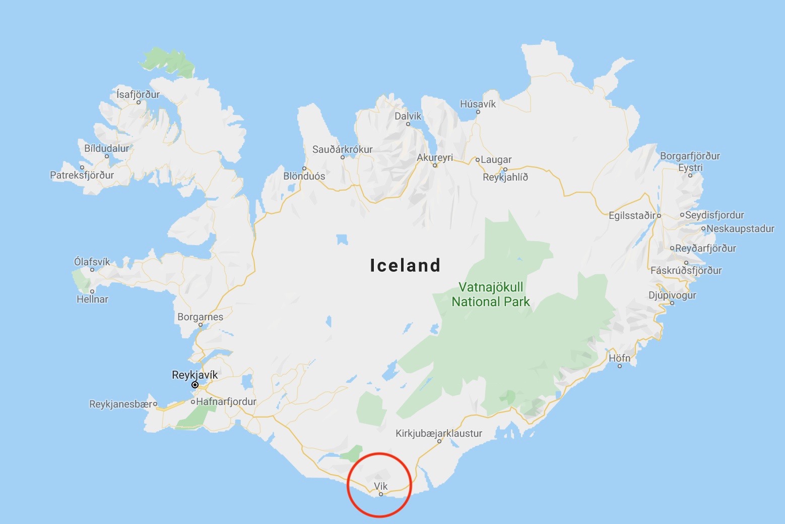
There’s also a sort of leveling that happens with the iconography where symbols don’t distinguish between features of a certain detail. The road symbol doesn’t convey much information about the road itself and its conditions. A six lane paved highway might be portrayed by the same symbol as a dirt “highway” in a rural area. This has happened to me before in places off the beaten track where the “main highway” from one city to another is little more than a dirt road, even though it uses the same symbol as a paved six lane highway elsewhere. City icons can also be misleading. Seen on Google Maps at a scale of fifty miles, the Icelandic town of Vik which has 300 people is portrayed by the same icon as the Indian city of Gaya with 470,000 people. While the symbols are meant to change relative to that country’s average town size, the iconography can be confusing for someone who is used to the icon resembling a certain town size. The same symbology that applies to one place won’t mean the same thing in a different section of the map.

Google Maps uses a variety of algorithms to construct its maps. They do a variety of things, from identifying signs and street ranking on Street View to determining the shortest route from point A to Point B. There are also algorithms which determine the size of the icons. These algorithms look at the content behind a business or location online, as well as considering the relevance of a business to the queried search. Therefore, new businesses, small businesses, or businesses with few reviews are at a disadvantage. I can imagine a dystopian future where those companies with the most money have the largest icons on smartphone maps. Fast food chains might pay to have larger icons than mom-and-pop shops. In other contexts, restaurants that cater to wealthy tourists might overpower the icons of local shops, leading to a kind of iconographical gentrification. Businesses on a busy, walkable street might traditionally be at an advantage and have more visibility from the increased foot traffic. However, the same locations on a smartphone map might suffer from a congestion of icons. There’s a suburban bias on smartphone maps, both in the icons that get depicted and in the routes selected. Increasingly, maps don’t reflect the reality you see as a pedestrian as much as they reflect positive feedback loops of privilege and visibility.
Google derives its name from a misspelling of the number “googol,” which is a 1 followed by a hundred zeros. The title was chosen to convey the sense that a Google search provides myriad information. The title of this piece is a play on this idea and has dual meaning. Google Maps, with its algorithms and map design, is indeed “one in a googol” of mapping possibilities. Representation never has one option, and the decisions behind how something is portrayed has real consequences. In addition, Google Maps and others start to supplant the space they seek to portray so accurately. The second meaning of the title reflects the human experience of living in the matrix of information that is Google. As information technology companies like Facebook, Google, and Amazon increasingly use data to reorganize physical space, we may find ourselves literally living under these companies. Deutsche Wells has a documentary which features a parody of a woman living in a world owned by Amazon. Amazon recommends products and political decisions to her, and is branded on everything from her baby to her refrigerator. We conventionally know Google as something to go on. Its information is something we tap into and out of. However, we may soon find ourselves not on but in Google, moving through a physical space shaped by the intangible forces of tech companies. Already, Sidewalk Labs, a section of Google’s parent company Alphabet, is working on developing a “smart” neighborhood in Toronto. The reshaping of space by data and sensors is already a very real thing. Because of the biases of representation and the fact that big tech companies play an increasingly strong role in shaping our world, we may find ourselves to be one in a world run by Google.

Leave a comment